
Elevate Your Lead Generation Game: 5 Landing Page Examples to Inspire You

You’re browsing the internet, and suddenly, you stumble upon a landing page that leaves you utterly captivated at first glance. The page is beautifully designed. The messaging is so on point that you believe that it was written specifically with you in mind. And before you know it, you’ve willingly handed over your email address without hesitation.
That is the magic of a high-converting landing page! And that is exactly the reaction you want to create for your own products and services for your audience when they land on your page.
What are lead gen landing pages?
In short: the main goal of lead gen landing pages is to generate leads for businesses and build a customer base.
They’re specifically designed to capture information from potential customers or leads. These pages are created with the intention of enticing visitors to provide their contact details, such as their name, email address, or phone number, in exchange for valuable content or offers.
These pages typically have a concise and attractive layout that focuses on highlighting the benefits of the offer and making it easy for visitors to fill out the lead capture form. They often include persuasive copy, compelling images or videos, and a clear call-to-action to encourage visitors to take the desired action. By optimizing these lead gen pages, businesses can effectively capture leads and convert them into customers, ultimately driving their sales and revenue.
What should a great landing page include?
The main job of a lead gen landing page is to motivate visitors to accomplish a specific goal. For example, they are handing over their email address in exchange for something of value to them in the form of a lead magnet.
Of course, landing page designs will differ across brands, target audiences, and industries. However, there are some best practices that, if applied well, will take your landing page from good to great. Such as having:
- A strong headline that hooks the reader’s attention at the top of the page
- A supporting sub-headline to confirm the reader is in the right place
- Compelling copy on the page that conveys the offer clearly and concisely
- A clear, singular call to action (CTA) to convert
- Social proof in the form of testimonials and reviews to back up your claims
To give your trust factor a boost, you might consider adding a credibility banner to your landing page as well. This is an optional add-on yet the display of client logos and media appearances along with your strong messaging would speak volumes to your track record.
The goal of this post is to help you understand what makes a successful, converting landing page, well, successful. We’ve collected examples from various industries and designs to give you a spark of inspiration for your next offer.
Lead generation landing page examples
1. Marie Forleo
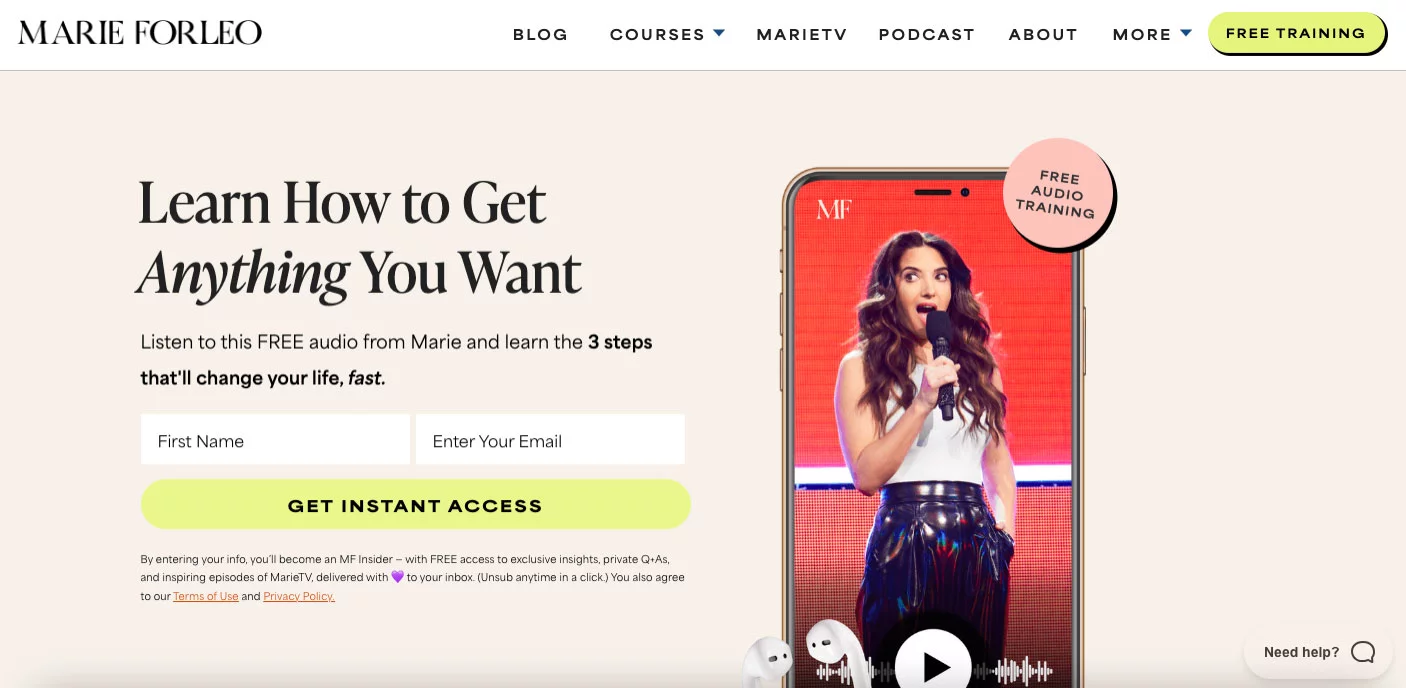
This landing page for Marie Forleo’s free audio training is an example of short-form copy. It contains an intriguing headline, a sub-headline, and a lead capture form.
The neutral colors of the background play a subtle yet supporting role by helping the rest of the landing page components stand out.
The headline instantly sparks intrigue and curiosity that makes you want to stay on the page a bit longer. If only to learn how to, well, get anything you want.
Known for helping other entrepreneurs create the business and life they love, the visitor can benefit from learning Marie’s life-changing steps for their life quickly through the call to action promising instant access to the training in exchange for their name and email.
2. Trello

Trello’s landing page puts project and team management at the core of their messaging. The graphic complements the headline by depicting various Kanban boards, team replies, and deadlines.
The color scheme gives a simple yet modern elegance feel as you move down the page. The blue CTA button stands out against the backdrop and the added “it’s free!” gives the visitor a compelling incentive to try the tool. And by including only one form field, they keep the friction way down making it super easy to generate leads.
3. ExpressVPN
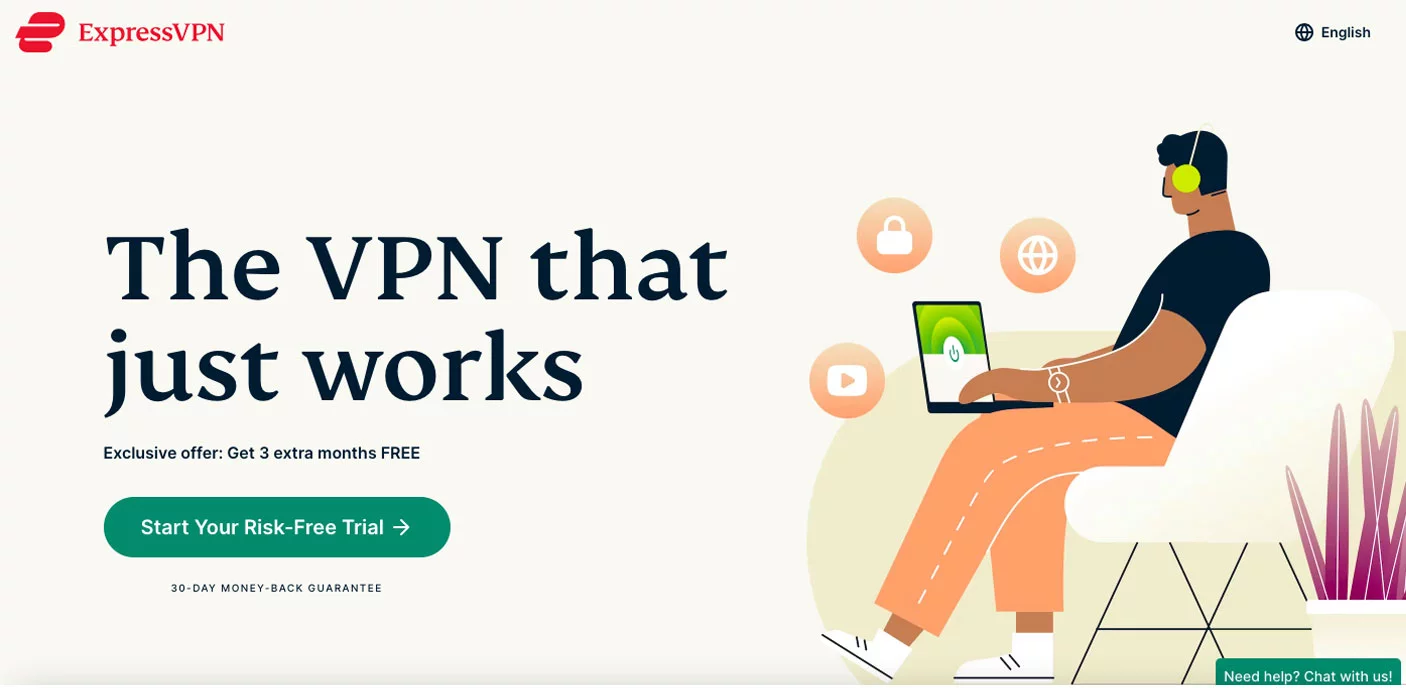
We live in a digital world where just about anything we need can be found with a few clicks. ExpressVPN, a security tool, wants to give its visitors peace of mind (and privacy) to continue exploring the web without worry.
The headline is straightforward. They understand their target audience and know they want their VPN to work. Visitors searching for a safer and more secure online experience, especially for professional use, would appreciate knowing that choosing ExpressVPN is going to do the job.
The hero graphic of a young person on a laptop with a couple of different social outlets and a lock symbol shown above him helps drive the message of care-free browsing knowing without question that they are protected.
Their CTA button copy is clear and enticing with, “Start Your Risk Free Trial.” This kind of copy effectively communicates the offer to potential customers and encourages them to take action. The phrase implies that there is no obligation or cost associated with trying out the product or service, making it more appealing to users.
Another bright spot of this landing page is the navigation bar. Why? Because there isn’t one. ExpressVPN took away the temptation we all have to click away to another page on the website by taking away the distractions and keeping the focus on the current page.
4. Monday

Mondays sometimes get a bad wrap, right? No matter where you find yourself on the love-hate spectrum for the first day of the week, there are many things to like about Monday, the cloud-based project management software.
Right off the bat, the page highlights options for personalization. No business is exactly alike and neither should their project management tool. By allowing the visitors to choose the options most relevant to their business, they can move forward on better footing. Featuring personalization on their landing page will surely boost conversions.
Easy navigation and a credibility banner of some of today’s more notable brands round off a great lead-generating landing page for the platform.
5. Canva
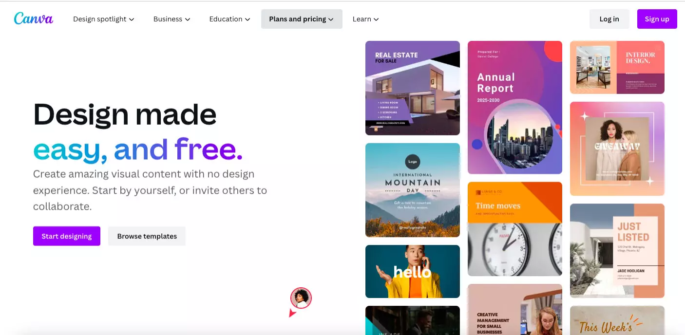
Implementing plenty of white space in its design, the content on Canva’s landing page is easily scannable, allowing the graphics to pop.
The headline and subheadline work seamlessly together to send the message that DIY graphic design, especially without a design background, can be easily achievable for their needs.
Further down the page, Canva bolsters its credibility by displaying statistics such as its monthly visitors, the number of designs and languages in its arsenal, and the percentage of Fortune 500 companies that utilize its platform.
Canva wisely displays Canva-created templates throughout the page, giving the visitors a visual of what they can produce for their own social media, websites, and presentations.
Conclusion
Do you have a new offer or looking to spruce up an old opt-in page? There’s no need to push it down your to-do list.
The inspiration for your next lead-generating landing page can reveal itself at any time. But the best place to find out what works for you and your business or brand is to experiment! Keep the best practices in mind but see what aligns with your values and style and allow your creativity to shine.
A high conversion rate is a strong indicator that the campaign is effectively persuading users to take the desired action, whether it be making a purchase, signing up for a newsletter, or downloading an e-book. One key element in improving conversion rates is the CTA, or call-to-action. A well-designed CTA prompts users to take the desired action and helps guide them through the conversion process. Additionally, effective lead generation is crucial for achieving high conversion rates. Lead generation examples include landing pages that capture user information through forms or pop-ups. These landing pages provide valuable content or offers in exchange for user data, allowing businesses to nurture leads and eventually convert them into customers. Overall, understanding the importance of conversion rates, utilizing effective CTAs, and implementing successful lead generation strategies are essential for driving conversions and achieving marketing goals.
Posted ago by Charles
Charles is the co-founder of Otowui and is responsible for marketing strategy and business development. He is a web enthusiast and digital marketing expert, with over 15 years of experience in the field. He enjoys creating unique and personalized user experiences for Otowui customers. He is also a developer and is passionate about the latest technologies to improve the performance and quality of Otowui's products.
